Wednesday, 4 May 2011

Filming - Day Three

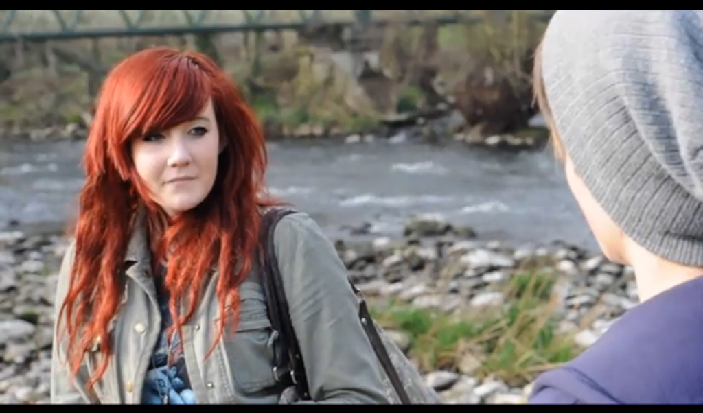
Day three of our filming was again focused on narrative shots but this time with the introduction of the female character; filming shots of the protagonist's failed attempts to attract her attention. For this day we knew we would need a variety of shots to reflect the different parts of the song where narrative shots are used, as the tempo and intensity of the music varies greatly between the verses, build ups and choruses, and one of our main aims was for the pace and length of our shots to reflect the mood of the song. We stuck to our storyboard in order to minimise filming time while also filming some other shots as well to be used in the video should we feel as though we need more footage, or that a certain storyboarded shot does not have the desired effect, and needs replacing.
The day focused around the two narratives characters and the interaction, or lack of interaction, between them.


The location chosen for this was the area surrounding myrtle park in Bingley, as it is often void of many passers by, allowing for only the characters to be shown in shot, both to reflect the protagonists' isolated state of mind and also so the focus stays always on the characters. We believe this was a good choice of location also due to the vast amounts of natural light, which made filming much easier. Here we filmed a mix of handheld and tripod shots, as even attempting to use the dolly outdoors would not be practical, and also on certain shots we panned the camera across to achieve a similar effect to that of the dolly.
Picture of filming the scenes of the protagonist

Overall the day was very successful and filming was done with minimal set backs, allowing for us to film everything we had planned, thus taking us one step closer to having a finished product.

Thursday, 31 March 2011

Poster


Part of our ancillary task was to make a poster, or page of a magazine, to advertise the digipak which we were creating. It needed to consist of our digipak, as well as release date, website and other information.

Above is the final poster, which we made with an A4 aspect ratio as the advertisement was for a magazine.

When creating the poster, I wanted to encompass the style of the digipak, and reflect it's themes of decay, brickwork and faded colours. Despite this, I also wanted to give it the interface of a modern, and somewhat vibrant product as to appeal to a wider audience and make the poster stand out, as to catch people's attention.

I realised the focal point of the poster was going to be the digipak, and so I made this considerably brighter than the rest of the poster by using burn and dodge tools in photoshop, to create the impression that a light was being cast on the digipak. I put the side and front-cover of the digipak side by side and skewed them, as to create a 3d looking projection. I then copied this into a new layer, flipped it vertically and re-skewed it to align with the main picture. I then used a transparent gradient on the bottom half, and this created the impression that the digipak was being reflected off the surface that it was stood on.

I used a brick wall texture in the background as to reflect the main themes of the digipak. I then used a dark grey metallic surface in the foreground; this is where I placed the digipak, and so the metallic surface was needed to make the reflection look genuine> I created this look by creating gradients, and using dodge tools to render areas to create a light glare effect.

I used the font of the 'Jimmy Eat World' title on the album for the poster album title, as this font is very spacious and bold, as to create an epic looking poster heading. I made this a light cream colour, as to give the impression of an aged white title, fitting in with the decay theme. The text introducing the album I skewed to make 3d, and placed next to the digipak with a reflection, to fit in with the rest of the poster as well as to stand out.

At the bottom of the poster I put the Jimmy Eat World website URL, with a subheading saying 'preorder', as this is something which many people put on album advertisements. I also used small logos of napster and itunes, for people to see where they could buy the digipak from.

Overall, I thought the poster turned out to be a success, as the composition of the poster fit in with ones we had researched, but stood out in it's own way in accordance with the themes of the digipak, both by using themes of dereliction as well as a modern and glamorous looking edge, in terms of the font, colours, and presentation of the digipak.

Digipak

Half of our ancillary task was to create the cover for a digipak, to contain the album of the band as well as the promotional music video. In designing the digipak, I wanted to stylistically capture the messages that are transmitted in the song 'Pain', and so I decided on the theme of broken down brickwork, representing 'futures' (the album title) in a negative manner. I also wanted to create an ironic juxtaposition with the fonts, and so used majestic looking fonts for the front cover, in irony to the brickwork. For the back cover, I wanted the track list to blend in more with the texture, and so used shreds of paper with the songs type-written on, to fit in with the emo genre. Below is the front and back cover of the digipak.

For both the front and back covers of the digipak I used a royalty-free texture of a broken brick wall, and used burn and dodge tools on photoshop to edit the lighting of them. I also pasted in a lightbulb for the back cover, and use burn and dodge tools to make this look realistic, and blend in with the rest of the cover. On the bottom of the back cover is the barcode and logos of the label and other relevant companies, also including the website of the band.

Overall I considered the digipak to be a success, and reflected the style of the song we had done the music video for. It both carried through stylistic elements of the video, as well as introducing a theme for the album, which is decay, and the idea of a negative future.

Sunday, 13 March 2011

Filming - Day two

Our second day of filming was focused on the narrative shots of the protagonist, in his bedroom, reflecting and then ripping apart pieces of paper. What we identified as a crucial element in these shots is the contrast in mood between the shots before the guitar solo, and during it. The difference between the two is that before the guitar shots, we needed to create tension, and did so by using dolly shots and tripod shots. I also instructed the actor to present himself as tense, and he did so by grabbing his hair, and looking downwards reflectively.

We realized that using a dolly on a carpeted floor would be an issue, as the wheel protectors on the dolly would rub against the floor, creating friction and vibrating, thus shaking the shot and adding noise to the clarity of the picture. We sought a solution to this problem, and found pieces of smooth wood that we could use underneath the dolly to provide a smooth surface for it, as pictured below.

Displayed on the right is the mess of paper that we used for the protagonist to rip up and throw about during his fits of anger during the guitar solo. We arranged them so they filled up the biggest possible space on the floor, allowing for the actor to rip them up and throw them about easily.

Below are screen captures of the footage we took on day two of filming. The top row are all smoothly taken shots, building the tension of the video. The bottom row of shots are all during the guitar solo, within which all the camera shots are handheld, and all involve a lot of movement. We plan on cutting very fast between these, to further enhance the energy of the sequence.

Overall, the day was a success, and ultimately got us one step closer to producing a finished music video. At present, we still have the narrative shots in the protagonist's mind to film, as well as the band shots, both of which we plan to film as soon as possible.
Friday, 4 March 2011

Music Advert Research

These are examples of adverts that have appeared in music magazines showing new CD releases. They are not from the same genre of music as our project although many of the conventions remain the same as they would in other genres.
The product being advertised is featured heavily in the adverts; taking up a large section to allow readers to properly see it, so that if they come across it in a shop they will know what it is and will recognise it.
Adverts will also often mentioned features within the album which the public will already be aware of, such as singles that have been released or in the case of a compilation album, the popular artists featured. Also featured are method of getting hold of the record, such as popular shops and websites it is available at. The record company responsible for the product are also mentioned.
The date of release is also mentioned in both of these adverts and would appear to, understandably be, an important factor.
The bottom advert is for a compilation of UK MCs and therefore maintains a gritty, underground feel to fit with the music being advertised where as the above advert has more of a clean, professional feel which is also very simplistic.

Monday, 7 February 2011

Digipack Research 2

This is the album cover for Linkin Park's live digipack "Road to Revolution". 
The centre piece of the cover is the band's logo which immediately causes fans to connect it to the band, which is useful in attracting previous fans who will form a large proportion of the target audience for this product. This logo has been incorporated into what is an artistic design with revolutionary connotations. The lions especially are normally used in logos for large, powerful entities such as countries or alliances. This idea is however juxtaposed with the grungy, worn background which may be eluding to the fact that supposedly modern powerful parties, particularly those that run countries are working out outdated systems and ideologies, which links back to the idea of a revolution which is mentioned in the title.


This is the back cover, which continues the themes of the front cover while giving information about what tracks are on the digipack. It also contains all other relevant or required information such as a barcode and details on the DVD, such as the companies involved in helping to produce and distribute it.

Thursday, 3 February 2011

Digipack Research 1

Here I have looked at examples of pre-existing digipacks of a similar genre to the style of music we are creating ours for.

This is an example of a digipack cover, taken from "Bullet in a Bible" which is a CD/DVD of Green Day's live performance in Milton Keynes. 

The main features of this cover lend themselves very well to the anti-political standpoint of the band, resembling governmental propaganda with a revolutionary twist, which is somewhat ironic considering that the band represent left wing ideologies but does hold true to their revolutionary attitude and lyrics. 
The stance of the vocalist on the cover mimics that of a political leader rallying followers to his cause, with the digipack title and band name following the direction of his hand, as if they themselves are being portrayed as a political statement. The angle at which the photograph has been taken (low angle) presents the vocalist as being in a position of power in front of the mass crowd he has drawn, which further backs up the idea of this as a political message as much as it is a musical DVD. Furthermore the colours used for this cover present it as an almost propaganda like image, with the contrast black and red which contains subtly the band's tour logo. This colour scheme also presents an element of juxtaposition with the text, making it stand out so it may be seen clearly, allowing it to be seen as obvious message to viewers.
This cover also contains the standard parental advisory and DVD logos that we will also need to include in our design.

This is the back cover of the above mentioned digipack. It maintains the cover scheme of the cover intermingled with screen shots from the DVD itself as well as a full track listing and other relevant information such as logos for companies involved in its production and distribution and also a bar code. These are features we may need to consider when creating our own digipack. The angle at which the stills cut the image make it seem interesting and allow for the bottom image to show the vastness of the crowd gathered; emphasising the size of the bands fan base and their influence in the world of music. The text used for the track listing is once again white, allowing for it to be noticed and read clearly against the red background, with less important information displayed in black.